


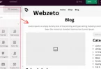
There are several techniques to wrap text around images. Using CSS properties like float and clear is a common method. The float property allows images to align left or right, letting text flow around them. Flexbox and Grid are more advanced techniques that provide greater control and flexibility. These methods help you create responsive designs that work well on different devices.
Table of Contents
Table of Contents
Basic HTML Image Tag
The HTML <img> tag is used to add images to a web page. It doesn’t need a closing tag.
- src: This attribute specifies the path to the image file. It can be a URL or a relative path to the image. For instance, if your image is in the same directory as your HTML file, you can simply write the filename. If the image is hosted online, you need to provide the full URL. The src attribute is mandatory, as it tells the browser where to find the image.
- alt: This attribute provides alternative text for the image. This text is crucial for accessibility, as it is read by screen readers used by visually impaired users. Additionally, the alt text is displayed if the image fails to load. It’s a good practice to make the alt text descriptive but concise, giving users an idea of what the image represents.
- title: This attribute offers additional information about the image. Usually, this text appears as a tooltip when the user hovers over the image. The title attribute can provide extra context or details that aren’t covered in the alt text. While it’s not as essential as the alt attribute, it can enhance the user experience by providing more information.
For example, to display an image named “example.jpg,” you would include the source.
- src=”example.jpg”: Indicates the location of the image file. If the image is located in a subfolder called “images,” you would write src=”images/example.jpg”. For an online image, you might use src=”https://example.com/example.jpg”.
- alt=”A beautiful scenery”: Describes the image for screen readers and if the image doesn’t load. This description helps users understand the content and context of the image. For example, you might write alt=”A beautiful mountain scenery with a clear blue sky” to provide a vivid description.
- title=”Scenic View”: Shows a tooltip with the text “Scenic View” when users hover over the image. This tooltip can give users a little extra information or context. For example, you might write title=”Scenic View of the Mountains at Sunrise” to provide more detail.
Using CSS for Text Wrapping
CSS (Cascading Style Sheets) is a powerful tool for controlling the layout and style of your web pages. When it comes to wrapping text around images, CSS offers several properties that can help you achieve a polished and professional look.
The float Property
The float property is commonly used to wrap text around images. By applying a float to an image, you can specify whether the image should float to the left or right of the surrounding text.
The float property can take several values, but the most common are left and right. For example, setting float to left will make the image float to the left, and the text will wrap around it on the right. Similarly, setting float to the right will make the image float to the right, and the text will wrap around it on the left.
To wrap text around an image that floats to the left, you would add a CSS rule to the image element to float to the left. This will cause the image to align to the left, with text wrapping around it on the right. Adding some margin to the right of the image will ensure that the text doesn’t touch the image directly.
The clear Property
The clear property controls the behavior of elements after a floated element. It can prevent elements from wrapping around the floated element, ensuring a clean layout.
When you use float, it can affect the layout of subsequent elements. The clear property helps to control this by specifying that an element should not wrap around a floated element. This is useful for maintaining the intended layout.
To prevent an element from wrapping around a floated image, you can use the clear property. This will ensure that the element is positioned below any floated elements, maintaining the desired layout and preventing text from wrapping around the image.
Advanced Techniques
When it comes to advanced techniques for wrapping text around images in web design. There are several more sophisticated approaches beyond basic CSS properties like float and clear.
CSS Flexbox
Flexbox is a modern CSS layout module that offers a flexible way to align and distribute space among items in a container, even when their size is unknown or dynamic. While primarily used for layout, Flexbox can be leveraged to create more complex text wrapping scenarios by controlling the alignment of both images and text within a container.
With Flexbox, you can easily align images and text horizontally and vertically within a container. This makes it possible to create dynamic layouts where text can wrap around images while maintaining responsiveness across different screen sizes.
CSS Grid
CSS Grid Layout is another powerful layout system in CSS that allows you to design complex grid-based layouts. It provides precise control over the positioning and alignment of elements within a grid container.
CSS Grid allows you to define rows and columns in a grid layout, specifying how elements should be placed within those rows and columns. This makes it possible to create sophisticated text wrapping layouts where images and text can be positioned precisely within a grid structure.
Media Queries
Media queries are CSS techniques that allow you to apply different styles to different devices or screen sizes. They are essential for creating responsive designs that adapt to various viewing environments.
By using media queries in conjunction with advanced CSS techniques like Flexbox and Grid, you can create layouts where text wrapping adjusts based on the screen size. This ensures a consistent and optimal user experience across desktops, tablets, and mobile devices.
JavaScript and Libraries
In some cases, more complex text wrapping requirements may necessitate the use of JavaScript or JavaScript libraries. These can provide additional control and customization over how text wraps around images, especially in dynamic or interactive web applications.
JavaScript can be used to dynamically adjust text wrapping based on user interactions or specific design requirements. Libraries like jQuery or custom JavaScript functions can enhance the functionality and presentation of text wrapping on web pages.
Common Issues and Troubleshooting
Despite the straightforward nature of wrapping text around images using CSS, several common issues may arise during implementation.
1. Overlapping Text and Images
One of the primary issues encountered is text overlapping with images, particularly when the image is not properly cleared or when margins are insufficiently defined.
- Cause: Text may overlap images if the float property is used without adequate margin settings, or if the clear property is not applied correctly to subsequent elements.
- Solution: Ensure that you use the clear property appropriately to prevent elements from wrapping around floated images unintentionally. For example, apply clear: both; to elements that should not wrap around floated images. Additionally, set appropriate margins around images (margin-right or margin-left based on float direction) to create enough space for text to wrap neatly without overlapping.
2. Issues with Different Browsers
Browser inconsistencies can sometimes affect how text wraps around images, especially when older browsers interpret CSS properties differently or lack support for newer layout techniques.
- Cause: Different browsers may interpret CSS rules such as float and clear differently, leading to layout discrepancies. Older browsers may also lack support for newer CSS features like Flexbox or Grid, impacting text wrapping behavior.
- Solution: Test your layout across different browsers and versions to identify any discrepancies early on. Use CSS feature detection or provide fallbacks for browsers that do not fully support certain CSS properties or layout techniques. Consider using CSS resets or normalization libraries to ensure consistent rendering across browsers.
3. Responsive Design Challenges
Ensuring that text wrapping behaves appropriately on various screen sizes and devices can be challenging, especially when using fixed-width layouts or inadequate media queries.
- Cause: Fixed-width layouts or insufficient media queries may lead to text wrapping issues on smaller screens or different devices. Text may overflow or wrap incorrectly, affecting readability and user experience.
- Solution: Implement responsive design principles using media queries to adjust text wrapping based on the viewport width. Use relative units (em, rem, %) for margins and padding to ensure flexibility across different screen sizes. Consider using CSS Grid or Flexbox, which inherently support responsive design and fluid layouts, for more complex text wrapping scenarios.
4. Performance Optimization
Large images or inefficient use of CSS properties can impact page load times and overall performance, affecting user experience negatively.
- Cause: Large image files or excessive use of CSS properties like background-image or box shadow can increase page load times, leading to slower performance. This can result in longer loading times and poorer user experience, especially on slower network connections or older devices.
- Solution: Optimize images for the web by resizing and compressing them appropriately. Use modern image formats like JPEG or WebP for better compression. Minimize unnecessary use of CSS properties and ensure efficient code structure to enhance page load speed. Utilize tools like PageSpeed Insights or Lighthouse to identify performance bottlenecks and optimize accordingly.
FAQs
Q. Can I wrap text around multiple images in HTML?
Yes, you can wrap text around multiple images by applying the float property to each image element and ensuring adequate spacing with margins.
Q. How can I align images and text vertically using CSS?
Vertical alignment of images and text can be achieved using CSS Flexbox or Grid layout techniques, specifying alignment properties such as align-items or align-self.
Q. What should I do if the text does not wrap around the image correctly?
Ensure that the image has sufficient space around it with appropriate margins (margin-right or margin-left) and use the clear property to prevent text from wrapping around images unintendedly.
Q. How can I make text wrap responsively on different screen sizes?
Implement responsive design principles with CSS media queries. Adjust margins and padding using relative units (em, %) to ensure text wraps appropriately on various devices.
Q. Is it important to include alternative text (alt attribute) for images when wrapping text around them?
Yes, providing descriptive alternative text (alt attribute) is crucial for accessibility. It ensures that users with visual impairments can understand the content and context of images, even if they cannot see them directly.
Conclusion
Mastering text wrapping around images in HTML enhances visual appeal and readability. By using CSS properties like float and clear, layouts can be created where text flows naturally around images, improving user experience. These techniques ensure content looks polished and maintains organization.
Understanding advanced CSS layouts such as Flexbox and Grid enables sophisticated designs that adapt to various screen sizes and devices. Responsive design, including media queries, ensures text wraps appropriately on desktops, tablets, and mobiles.